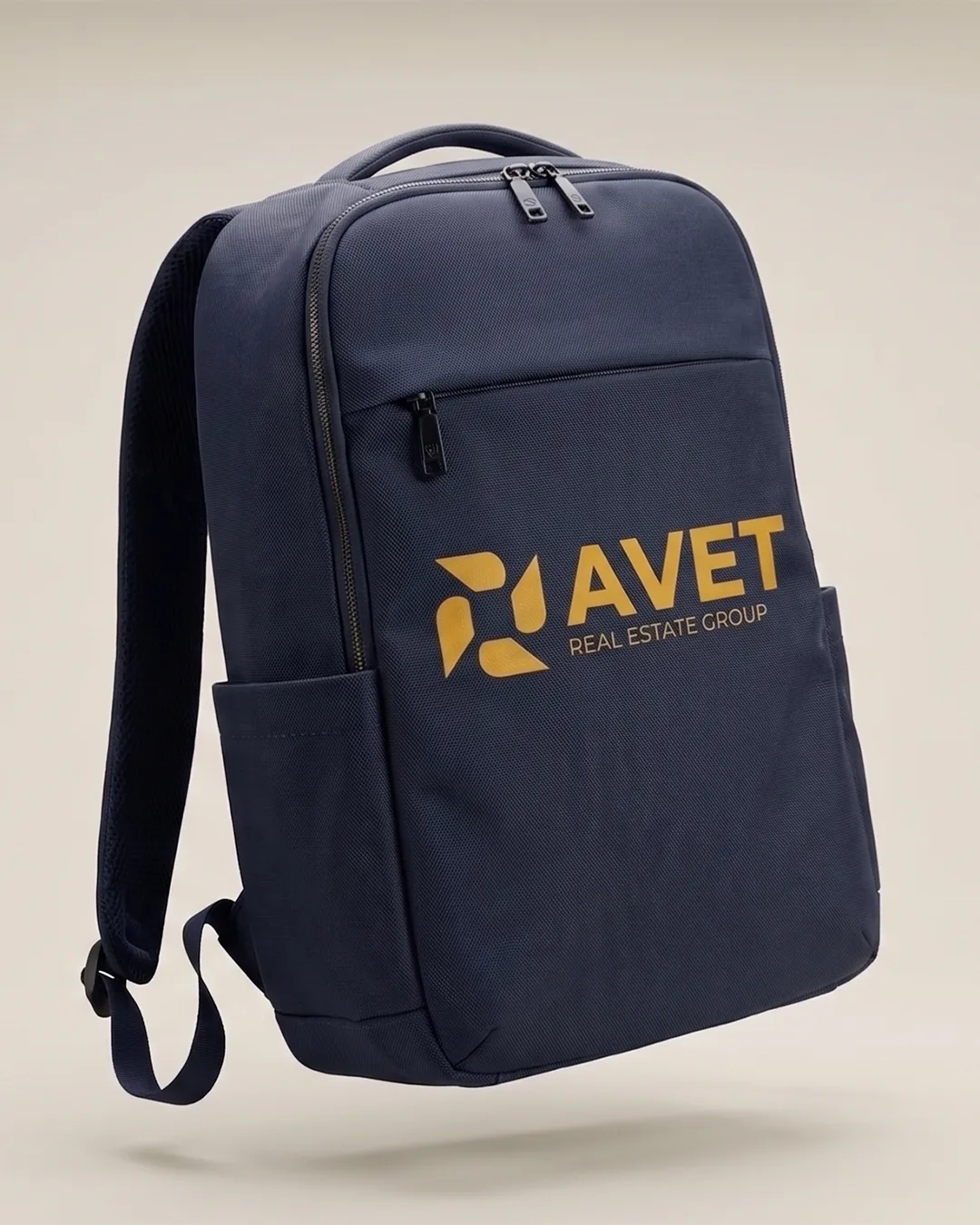
Avet Real Estate Group
Overview
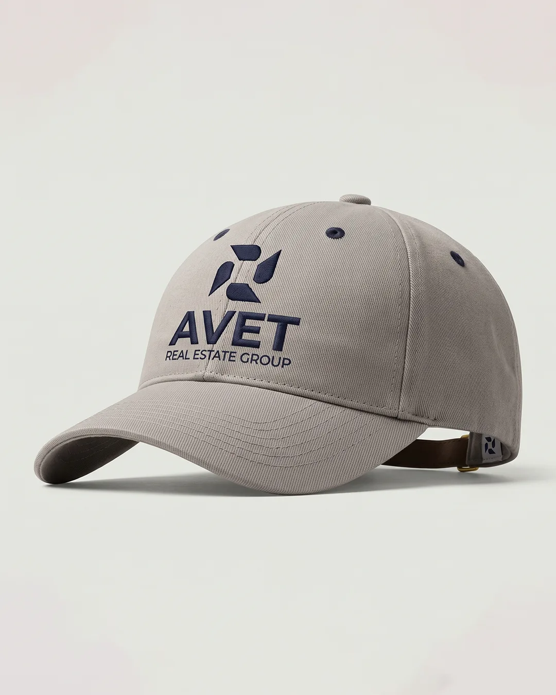
AVET Real Estate Group is a contemporary real estate brand identity built around the ideas of architecture, trust, movement, and new opportunities.
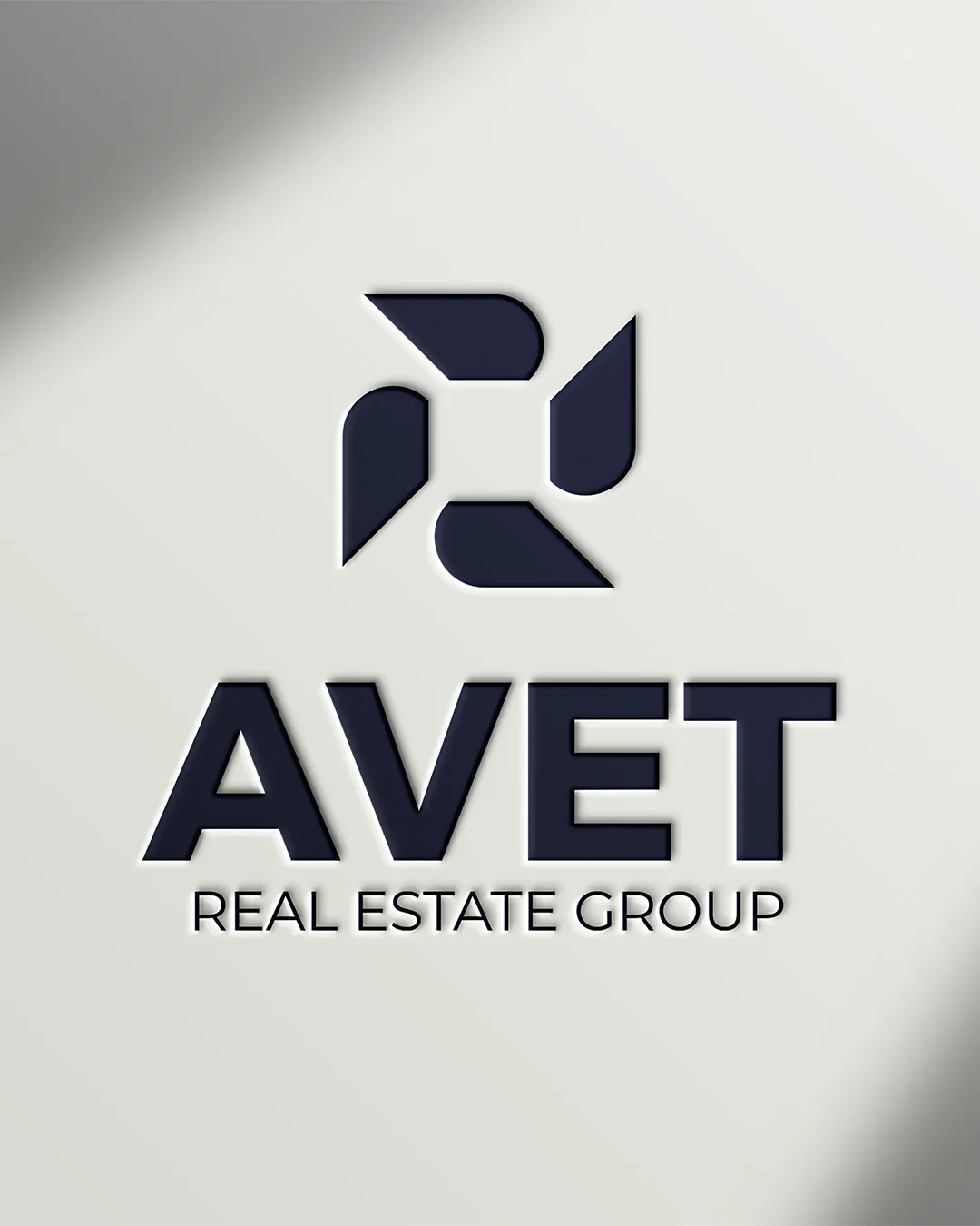
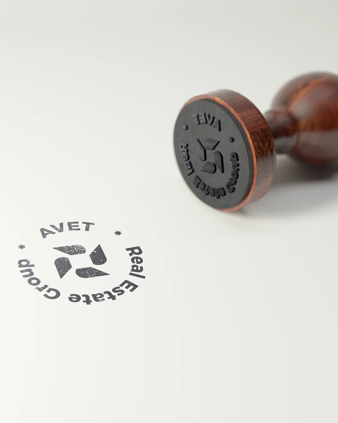
The visual identity combines a geometric architectural symbol with a conceptual reference to wings, creating a distinctive and memorable mark that connects the brand's name with its purpose.
The concept
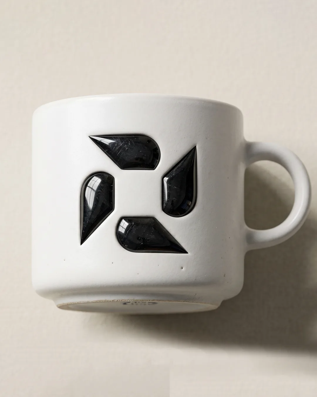
The logo was developed from an architectural top-view perspective.
The four geometric elements are arranged around a central negative space, creating an abstract interpretation of a building viewed from above. The structured geometry reflects the nature of real estate while giving the symbol a modern and recognizable character.
At the same time, the four forms can be perceived as wings in motion.
This second layer of meaning is directly connected to the name AVET. The Armenian word «ավետիս» (avetis) means good news, glad tidings.
The wings therefore become a metaphor for bringing good news, new opportunities, and positive change into people's lives.
The combination of architecture and wings creates the central idea of the identity:
A place is more than a property. It is the beginning of a new opportunity.
Symbolism
- Architecture. Represents real estate, structure, stability, and the physical spaces where people build their future.
- Wings. Represent movement, freedom, growth, ambition, and the arrival of something positive.
- Negative space. The central opening gives the symbol visual balance and creates a sense of space, openness, and possibility.
Together, these elements form a symbol that is both architectural and dynamic.
Visual language
The identity is based on a minimal geometric language, combining strong angular forms with carefully controlled rounded edges.
The contrast between these elements creates a balance between:
- Structure × Movement
- Stability × Freedom
- Architecture × Emotion
- Precision × Human experience
The result is a visual identity that feels confident, contemporary, refined, and adaptable.
Design philosophy
The goal was to avoid the typical visual language of real estate brands (houses, rooftops, keys, or literal buildings) and instead create a more abstract and ownable visual symbol.
The result is a mark where the meaning is discovered gradually:
Building → Space → Wings → Movement → Good news → New opportunity
This creates a visual identity with both functional clarity and conceptual depth.


 Next project Brise
 Have a project in mind?
Tell me what you're working on and I'll get back to you by email.